Introduction
ggpatina is a small toolkit for giving your
ggplot2* figures an analog makeover. Effects are
applied after the plot is rendered: you build a normal plot,
convert it to a magick image
with as_magick(), and then pass that image through one or
more patina filters. The package also includes a few lightweight themes
and helpers for period fonts so that the whole graphic carries the vibe.
Code chunks below are evaluated when the vignette is built, so any plots
they produce will show up automatically. This vignette walks through
several effects to illustrate the typical workflow.
* The plots can be applied to any figure provided it is converted to
a magick object, but most of the convenience functions and
workflows assume ggplot input.
Blueprint style
We’ll start with a basic scatter plot and gradually turn it into a blueprint.
# build the plot as usual
base <- ggplot(mtcars, aes(wt, mpg)) +
  geom_point(aes(shape = factor(cyl))) +
  geom_smooth(se = FALSE, linewidth = 0.5) +
  labs(title = "Fuel efficiency by weight",
       x = "Weight (1000 lb)", y = "MPG", color = "Cyl") +
  theme_minimal()

# convert to a magick image and apply the blueprint patina
base |>
  # Add some hand-drawn effect (and convert to image)
  hand_drawn_wiggle(width=3, height=2) |>
  # Apply a blueprint patina
  patina_blueprint()
#> Ignoring unknown labels:
#> • colour : "Cyl"
#> `geom_smooth()` using method = 'loess' and formula = 'y ~ x'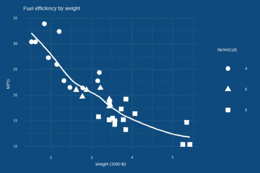
Slide transparency
The transparency slide effect mimics a projected slide.
# start from the base scatter plot
base <- ggplot(mtcars, aes(wt, mpg)) +
  geom_point(color = "steelblue") +
  ggtitle("Fuel efficiency")

# add the slide-style theme and nice font
p_slide <- base + theme_transparency() + period_font_theme("slide-1980s")

# render to a magick image, then give it slide artifacts
img <- as_magick(p_slide, width=3, height=2)
slideify_transparency(img)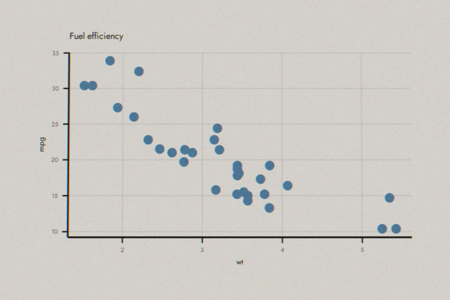
Journal effects
Give the impression that the plot was copied from a dusty journal in the library.
# start from the base scatter plot
base <- ggplot(mtcars, aes(wt, mpg)) +
  geom_point(size=0.5) +
  labs(
    caption = "Figure 1. Imapact of vehicle size on fuel efficiency."
  )

# add an old school theme and font
p_journal <- base + theme_journal_1930s() + period_font_theme()

# render to a magick image, then give it slide artifacts
img <- as_magick(p_journal, width=2, height=1.5)
scanify_journal(img)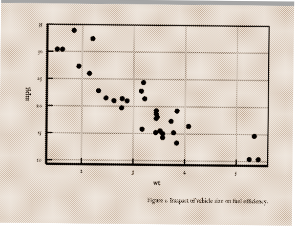
Ink bleed
Ink bleed gives a photocopied or cheaply printed feel where edges blur and ink spreads into the paper.
# reuse the base scatter plot
base <- ggplot(mtcars, aes(wt, mpg)) +
  geom_point() +
  labs(
    title = "Nation's fuel economy problem driven by size",
    caption = "Expert's analysis of cars released last year",
    y = "MPG",
    x = "Weight (x1000 lb)"
  )

# newspaper theme sets up the flat tones
p_news <- base + theme_newspaper()

# convert and apply effects
as_magick(p_news, width=3, height=2) |>
  patina_newspaper()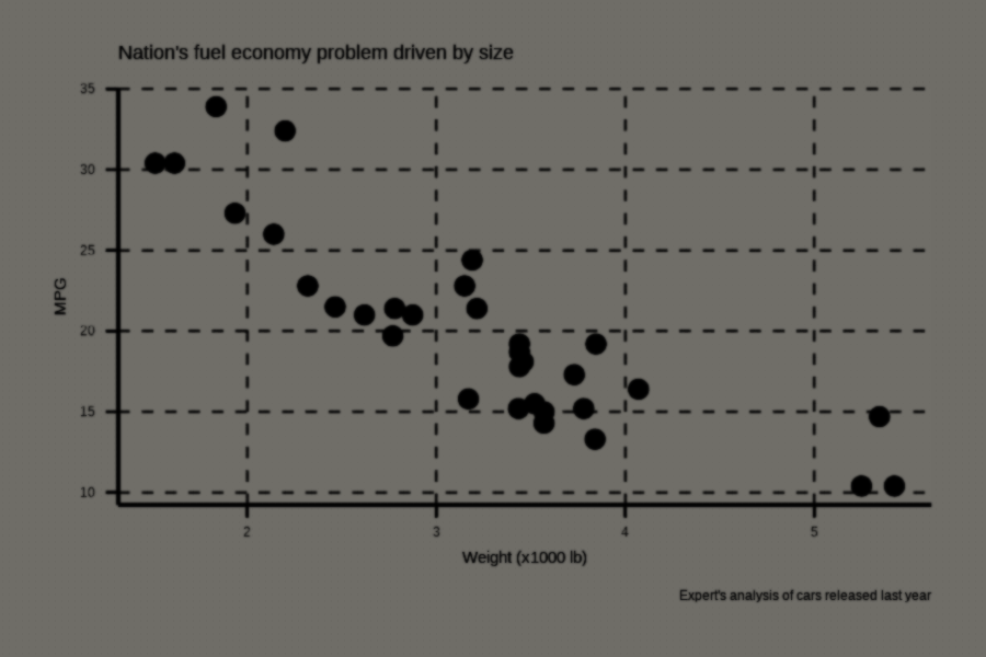
Kodachrome photo
Warm colors and a soft fade evoke the look of vintage Kodachrome film.
base <- ggplot(mtcars, aes(wt, mpg)) + geom_point(color = "firebrick")
p_koda <- base + theme_transparency()
img <- as_magick(p_koda, width=3, height=2)
patina_kodachrome(img)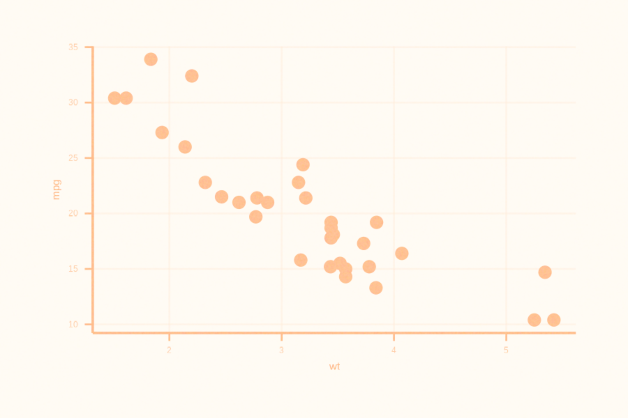
Newscast screenshot
This effect mimics a low-resolution television capture.
base <- ggplot(mtcars, aes(wt, mpg)) + geom_point(color = "goldenrod")
p_cast <- base + theme_newscast()
img <- as_magick(p_cast, width=3, height=2)
patina_newscast(img)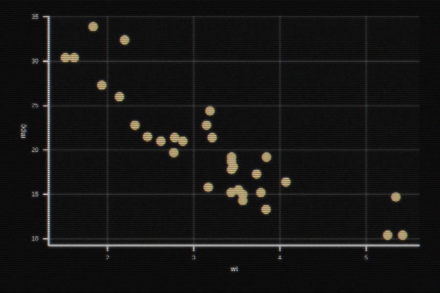
Photocopy
Misaligned colors and grain suggest a worn-out photocopier.
base <- ggplot(mtcars, aes(wt, mpg)) + geom_point()
img <- as_magick(base, width=3, height=2)
patina_photocopy(img)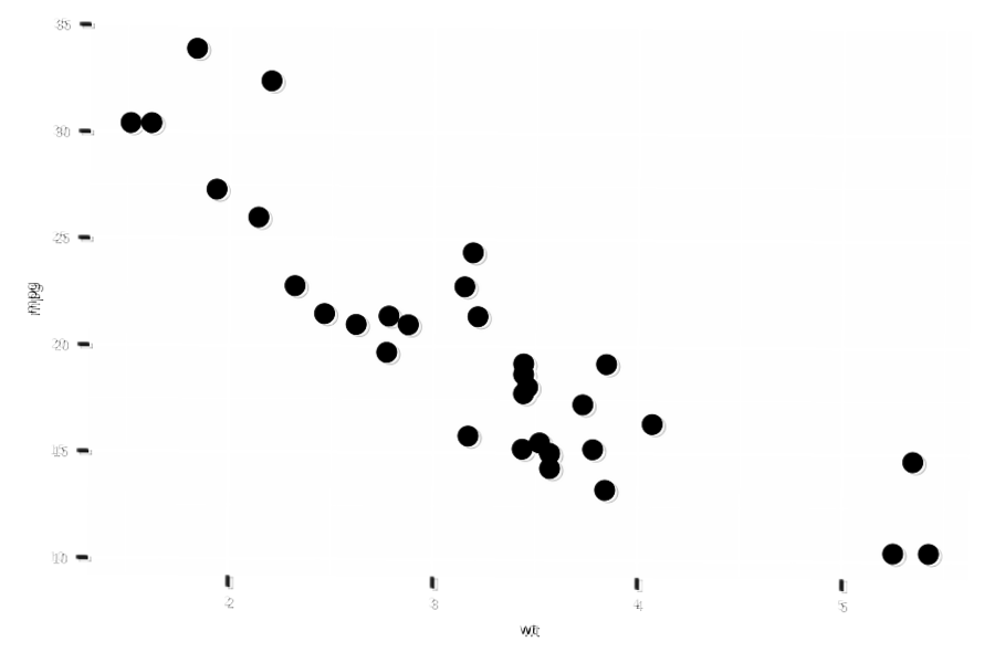
These examples are just a starting point. Combine effects and themes to give your plots any era’s personality.